CASE STUDY /
Defence Construction Canada
Designing for Change
Over nearly a decade, DCC’s annual reports evolved through changing leadership, brand directions and creative direction, while many of the production requirements remained firmly in place. My role was to create a publication that could feel fresh and distinctive each year while making a substantial amount of information clear, engaging and genuinely usable.
My first DCC Annual Report was the 2013–14 edition. The project was substantial from the outset: the Annual Report averaged around 100 pages per official language, accompanied by a shorter Corporate Summary designed as a companion piece.
The two publications needed to feel connected without simply being scaled versions of one another. Both had to communicate a large amount of corporate and financial information clearly, while remaining engaging enough to encourage people to actually read them.
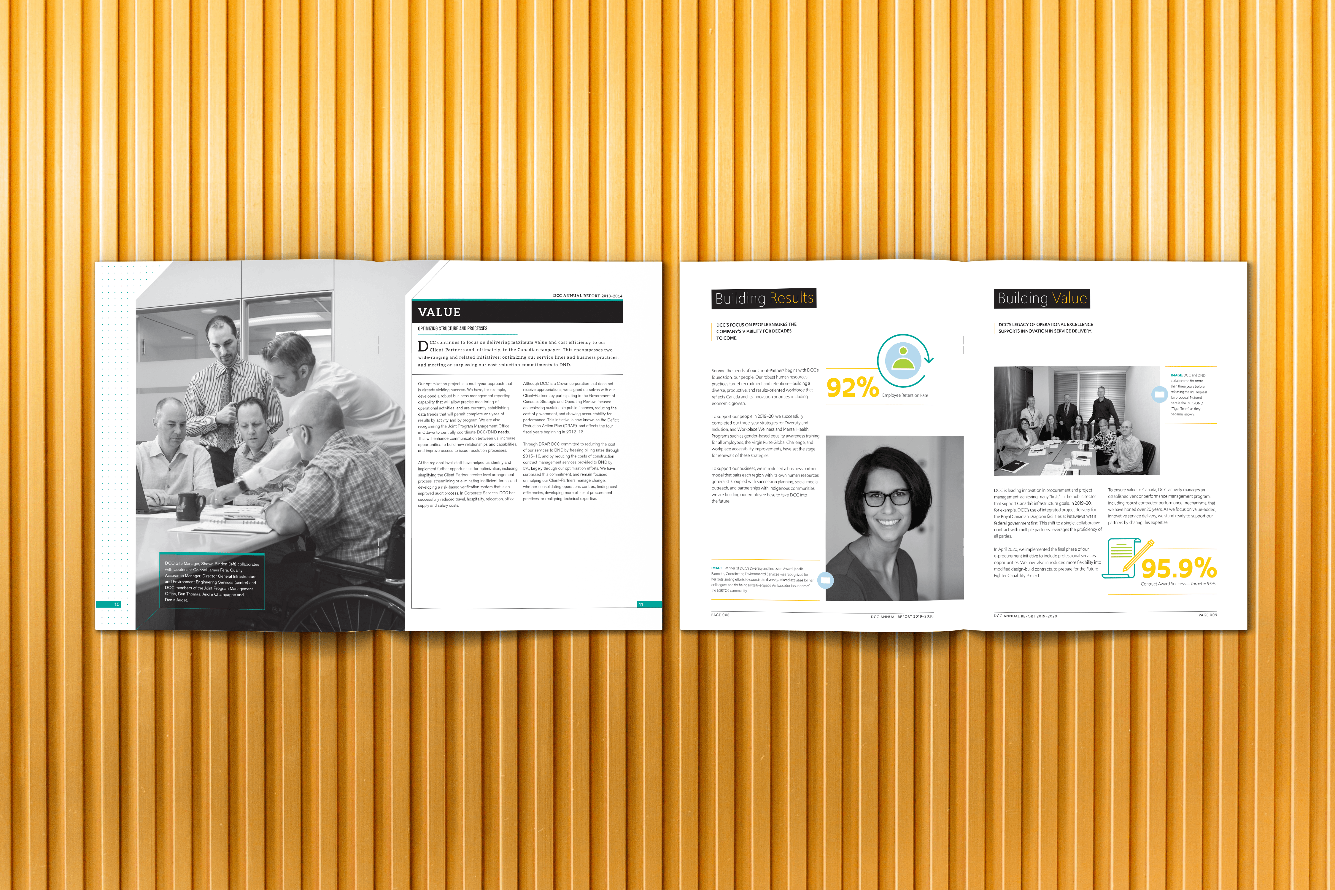
There was also a significant production challenge. In the early years, the reports were printed offset using a very limited colour palette: black plus a single Pantone colour. Photography was black and white, and each year's colour had to be distinct from the previous editions while avoiding colours associated with Canadian political parties.
These restrictions didn't change from year to year. The challenge was to make each report feel completely different while working within essentially the same visual and production toolkit.
The reports also followed an established editorial structure. Each major section opened with a large magazine-style spread and a prominent photograph—a compelling design device, but one that could become challenging when the right image wasn't available.
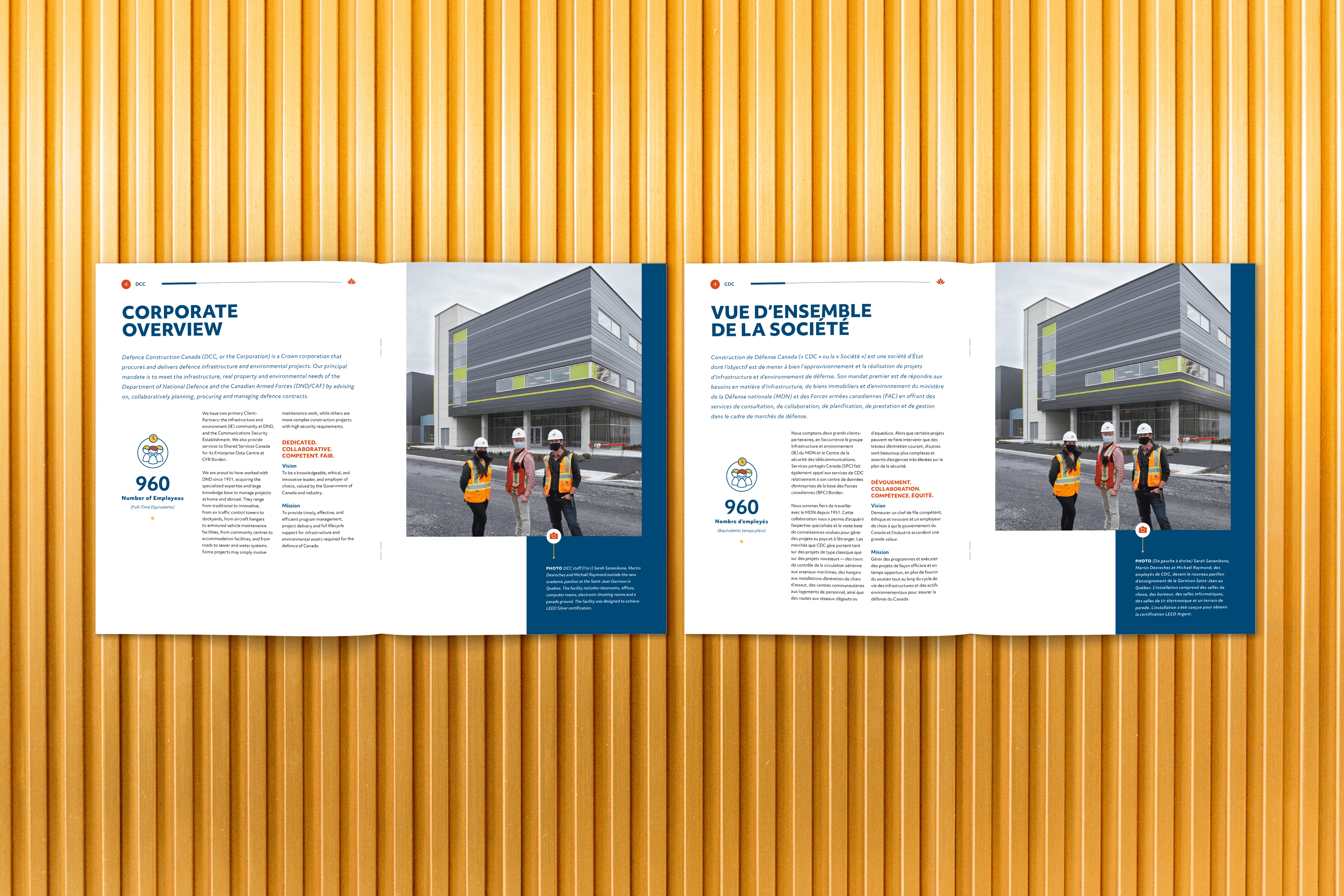
Then there was the added complexity of bilingual pagination. DCC required the English and French versions to follow exactly the same structure, with corresponding sections beginning on the same page numbers in both languages.
French copy could run approximately 30% longer than the English, so the layouts had to accommodate significantly more text without changing the overall pagination. The goal wasn't simply to make both languages fit—it was to make them fit in the same place.
I approached the reports as an evolving editorial design challenge: maintain the structural requirements and production constraints, but find a genuinely new visual solution every year.
Finding Variety Within a Limited Palette
With only black and one spot colour available, typography, scale, white space, image treatment and composition had to do much of the heavy lifting.
Each year, I developed a new visual approach around the available colour, deliberately avoiding anything too similar to the previous edition. Photography remained predominantly black and white, so its selection, cropping and placement became an important part of differentiating each publication.
The restrictions were consistent. The creative solution wasn't.
This meant continually finding new ways to establish hierarchy, create visual rhythm and give each report its own personality without relying on an expanding palette or increasingly elaborate production techniques.
Designing for Bilingual Pagination
The English and French versions had to function as two independent layouts while remaining structurally identical. Every major section, feature and piece of content needed to land on the same page in both versions.
That meant designing with the French version in mind from the very beginning rather than treating translation as a final production step.
I built flexibility into the layouts through deliberate decisions around typeface selection, sizing, column widths, spacing and information density. Condensed typography was sometimes particularly useful in sections where the additional French copy needed to fit without compromising readability.
The financial sections were particularly complex. The reports contained extensive financial tables and detailed information that needed to remain accurate, legible and consistently paginated in both languages.
Rather than treating those pages as an unavoidable wall of numbers, I approached them as an information-design challenge. Typography and structure became tools for making dense financial information easier to navigate—something that, as a self-professed former mathlete, I actually found rather satisfying.
When the Creative Brief Changed
For several years, the established production restrictions remained in place, but there was another consideration: after the first report, the client felt the publication was beginning to look too expensive. The design was therefore intentionally toned down for a period, requiring a more restrained approach to creating visual interest.
Then, for the 2019–20 report, the creative brief changed dramatically.
DCC had a new president and a new vision for the publication. The previous aesthetic direction was no longer what they wanted. They were looking for bolder layouts, more colour, more visual interest and infographics wherever the information allowed for them.
I responded by treating the report much more like an editorial publication. Colour became a larger part of the visual system, layouts became more expressive, and information was translated into visual forms wherever possible.
I was also tasked with creating a technical illustration based on one of DCC's actual facilities for the cover. Rather than relying solely on photography, the illustration gave the report a distinctive visual entry point while directly connecting the publication to the organization's work.
The new direction was well received. The following year, however, brought another major change: DCC introduced a new corporate brand. For the 2020–21 report, the challenge became translating that new identity into an established publication while maintaining the editorial clarity and visual interest developed over the previous year.
Over the course of the relationship, I designed DCC's Annual Reports and Corporate Summaries from 2013–14 through 2020–21.
Across those years, the reports demonstrate a different kind of consistency: not making every publication look the same, but consistently solving the same complex communication problems while finding new creative solutions.
I worked within strict bilingual pagination requirements, substantial financial content, recurring editorial structures and, in the early years, significant print-production limitations. Within those constraints, each report was given its own visual identity and approach.
When DCC's creative direction eventually shifted, I was able to respond with a much more expressive editorial approach, introducing bolder layouts, infographics, expanded use of colour and a custom technical illustration. When the organization subsequently introduced a new brand, that approach evolved again.
The result is a collection spanning nearly a decade that shows not just how the design changed, but how a publication can continually evolve without losing sight of its purpose.
The Takeaway
Creative constraints don't necessarily limit the work—they can force you to think harder. Designing a new visual experience year after year, within many of the same production and structural requirements, meant finding new possibilities in a deliberately limited toolkit.
